Overview
Linko is a social platform for music lovers, helping users discover friends who share their taste in music. Beyond matching over favorite artists and genres, it lets users explore upcoming concerts, join event forums, and connect with others attending the same shows, turning solo music experiences into a shared community.
The Problem
People often lack meaningful, interest-based social connections, especially when in new cities. Music can bridge this gap, but there was no dedicated platform that combined concert discovery with social matching and community building in one place.
Our Solution
Our goal is to help music lovers make friends in a safe, low-pressure space, turning shared music tastes into real connections. From bonding over favorite artists to meeting fellow concert-goers, the app focuses on creating memorable experiences and fostering a welcoming community for all.
Research
To better understand our target audience and their challenges and needs I conducted some research before jumping into the design process.
Target Audience
Linko targets young adults aged 18–30, including students and early-career professionals in North America, who are passionate about music and value safety when meeting new people. These users are looking to connect with others who share similar music tastes, attend concerts together, and build friendships around shared experiences.
User Personas
I developed these three personas, the International Student, the Busy Professional, and the Expat Healthcare Worker, to ground my design in real-world human needs. By synthesizing research into Annie, Brad, and Catiana, I moved beyond "general users" to solve for specific barriers like safety, time constraints, and cultural isolation.
Action Points
- Add Verified Profiles for safety and to lower the barrier for solo and international users.
- Created group matching tools for users seeking specific cultural niches (e.g., fellow OFWs).
- Include language and status tags in profiles to foster connection through shared backgrounds.
Design Process
User Flow
My team and I created a user flow to map out how users would move through the app. This helped us identify key touchpoints, reduce friction, and ensure the experience feels simple and intuitive. By visualizing the journey early, we were able to design a smoother, more user-centered experience.
Linko – Userflow Report (PDF)Low-Fidelity Wireframes
Low-fidelity wireframes explored Linko's flow and key interactions. Vinyl-shaped profiles and music-inspired assets kept the experience fun and concert-focused while testing how users would connect and navigate the app.
Style Guide
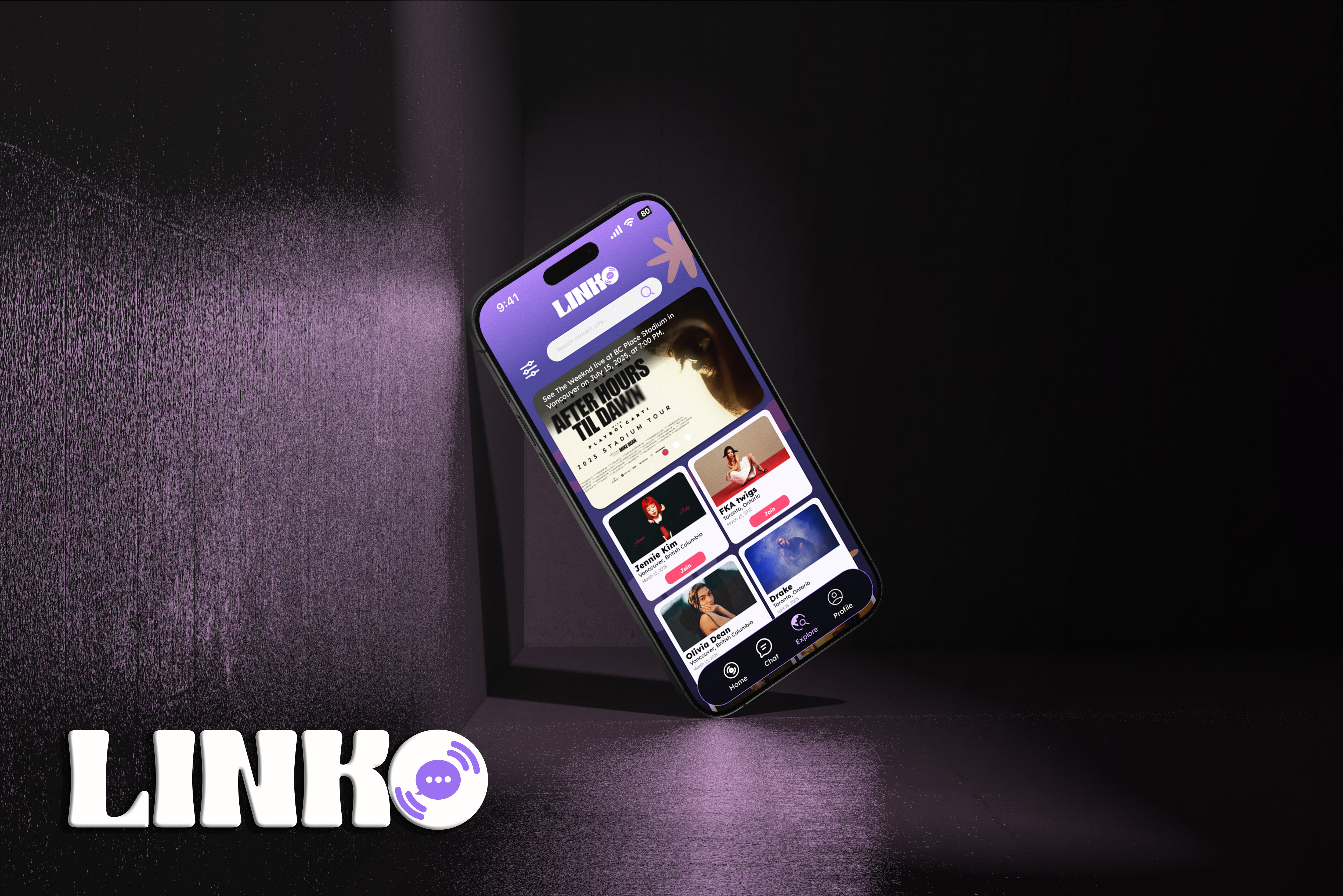
The Linko logo combines a vinyl record and a chat bubble, symbolizing how music brings people together through conversation. It reflects the app's mission of connecting music lovers and helping them share live concert experiences with new friends.
Linko's color palette and typography create a playful yet clear brand identity. Dream Violet sets a creative tone, Neon Lime accents drive interaction, and Coral Pulse buttons guide actions. Lexend keeps text readable, while Ruffly Bold adds personality to key elements, balancing clarity with visual impact.
Revisions
Matching Buttons Revision
Originally, we used play and pause icons for matching to reinforce the musical theme. However, testing showed they weren't intuitive or accessible for users. We revised the design to use the familiar heart and "X" icons, improving clarity and making interactions more natural and user-friendly.
Click to expand!
Click to expand!
Explore Feature Revision
Originally, users joined a concert and were shown random attendees to swipe and match with. We revised the feature to prioritize community by introducing a shared concert forum where users can chat with everyone attending. Profiles are still viewable, with the option to match and send friend requests, but the updated design encourages more open, low-pressure interaction first.
High-Fidelity
Final Features
- Onboarding — Guided sign-up that captures your vibe and music taste to deliver better matches.
- Matching — Swipe through music lovers and connect with people you'd like to be friends with.
- Explore — Join concert forums, discover fellow fans, and find companions for upcoming shows.
- Chat — Message matches, friends, and forums—or create group chats to grow your circle.
- Profile — Express yourself with photos, prompts, and personal tags to boost connection potential.
Results
Linko evolved from a simple matching concept into a community-driven platform that prioritizes safety, shared experiences, and meaningful interaction. Through iteration and testing, I refined key features, like Explore and matching, to be more intuitive and inclusive. This project strengthened my ability to balance branding with usability, design for low-pressure social interaction, and turn user feedback into impactful product improvements.